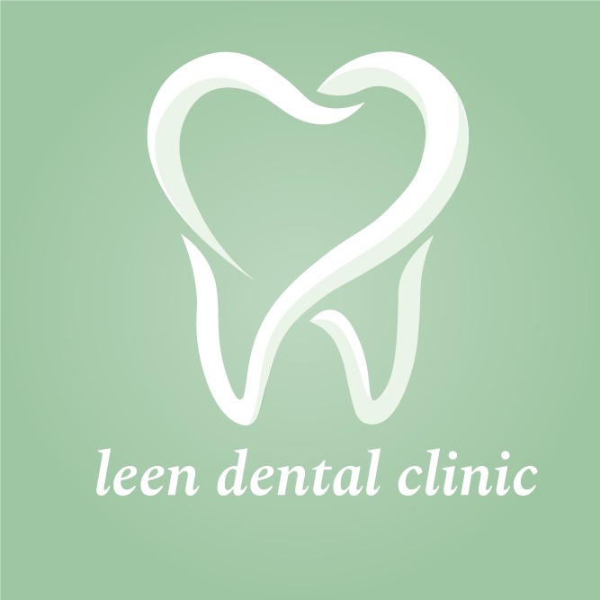
leen dental clinic
I built Leen Dental Clinic's brand identity from the ground up logo, color palette, typography, and visual guidelines anchored around a calming sage green and the tagline "The Softer Side of Dentistry." The goal was to break away from the cold, clinical look typical of dental branding and create something warm and reassuring instead. Beyond the visual identity, I manage the clinic's social media presence and content strategy, producing all assets independently from social posts to brand guideline documentation to help the clinic build a recognizable, trustworthy presence in a competitive local market.
I built Leen Dental Clinic's brand identity from the ground up logo, color palette, typography, and visual guidelines anchored around a calming sage green and the tagline "The Softer Side of Dentistry." The goal was to break away from the cold, clinical look typical of dental branding and create something warm and reassuring instead. Beyond the visual identity, I manage the clinic's social media presence and content strategy, producing all assets independently from social posts to brand guideline documentation to help the clinic build a recognizable, trustworthy presence in a competitive local market.
قراءة دراسة الحالة
التحدي: Leen Dental Clinic had no existing brand identity, no social media presence, and no visual system to work from. Dental clinics in the local market typically lean cold and clinical white, sterile, impersonal which can reinforce the anxiety many patients already feel about dental visits. The clinic needed a brand that felt warm and trustworthy from day one, built on a limited budget with no prior content history.
العملية: I started by researching color psychology in healthcare branding to find a palette that felt calming rather than sterile, landing on a sage green anchor color. I explored Arabic and English typography pairings to match the brand's "softer side" personality, then defined a brand voice that felt human and reassuring. From there, I built a logo, full visual identity system, and a brand guideline deck to keep everything consistent followed by a content strategy plan to bring the identity to life on social media.
الحل: A complete brand identity built from scratch: a logo and color palette centered on sage green (#B5C9B1), warm typography, and the tagline "The Softer Side of Dentistry." I applied this system consistently across social media content, managing the clinic's posts and visual presence independently from concept to publish.
النتيجة: The clinic's social media following grew from 75 to 173 followers in one month a 131% increase validating that a softer, more human visual identity resonated with the local audience. The project reinforced how much early-stage brand decisions, like color and tone, directly shape audience trust before a single sale or service is ever sold.